Dee Braaten, Real Estate Professional
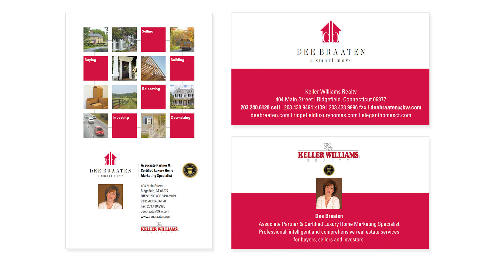
The challenge in designing the brand for Dee Braaten, Real Estate Professional, was to create a vivid and sophisticated identity that reflects her expertise and approachable style. The new logo plays off her initials with clean lines and an impactful mark, resulting in an aesthetically appealing design that resonates with clients and leaves a lasting impression.
In a crowded realtor market, each individual broker needs to stand out from the crowd and build an image that appeals to the community demographic. Dee Braaten sought to brand herself as a real estate market professional who is experienced, well versed in all aspects of the market and industry, sensitive to client needs and focused on building personal and strong client relationships.
Dee’s logo plays off her initials and utilizes clean lines, an impactful mark and an aesthetically appealing design that resonates and is memorable with her target audience. An initial print advertisement capitalizes on bold blocks of color and visuals to convey her comprehensive range of service offerings.