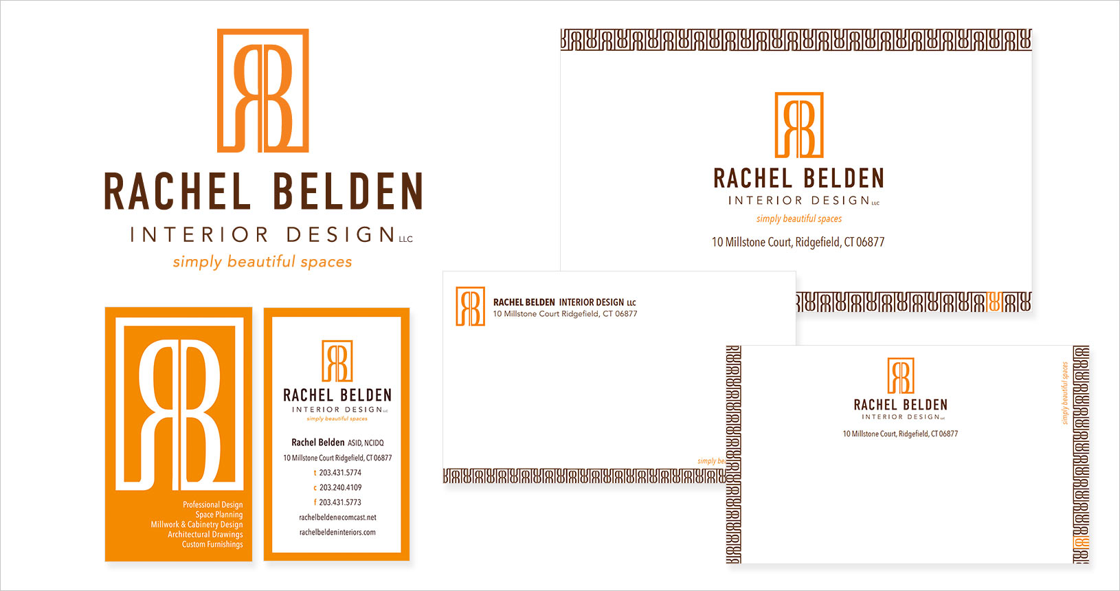
Rachel Belden Interior Design
Our goal was to create a visual identity commensurate with the professional and sophisticated nature of the interior design business.
Rachel Belden had been providing exceptional design services to residential clients since 2003. Her original, fresh and engaging design approach reflects her passion for design, extensive industry experience, architectural planning expertise and professional interior design training. But her business lacked a visual identity, commensurate with the professional and sophisticated nature of the interior design business. Our task, was to build a new, engaging business brand that is highly professional in its look and feel, communicates the design expertise (and its underlying strong portfolio of work) and acts as the foundation for its marketing and sales efforts.
Our concept uses clean lines and unexpected graphic composition to define the brand. The logo mark utilizes the first letters on the name, unifying them in a unique construction to imitate the vertical nature of two doors that can open to welcome a visitor into the home. The mirroring effect of the R and the B create a Greek-key like mark whose juxtaposition of straight lines and rounded edges combine for a highly sophisticated and beautiful graphic. The deep colors of orange and brown reflect Rachel’s passion for powerful yet warm, welcoming hues. The two, sans seraph font selections work beautifully together to support the clean and artful expression of the mark and text. The tagline “simply beautiful spaces” succinctly captures the business’ emphasis on future interior design outcomes. As a unified entity, the logo’s sleek, striking and sophisticated execution is highly memorable and easily translated for multiple applications in traditional print media and in the digital universe.


